Galleri nivå #5 – Intervju med Angela Moramarco
Varje månad hjälper jag speltidningen LEVEL att sammanställa material till deras nya avdelning Galleri LEVEL. Här presenteras konstnärer från alla världens hörn tillsammans med deras personliga tolkningar av välkända spel.
Konceptillustratören Mads Peitersen var inte ensam om att bli intervjuad i oktobernumret av LEVEL, utan fick dela rampljuset med den talangfulla kreatören Angela Moramarco. Som idéskaparen bakom det intressanta konceptet AnatoWii, berättar hon om inspirationskällor och tankar bakom hennes kreation.
Berätta lite kort om dig själv.
My name is Angela Moramarco. Though I usually go by Angie or Ang. I’m 29 and I live in Brooklyn, NY. I work in Manhattan as an advertising art director
Har du någon koppling till spelindustrin?
Besides being an avid consumer of it? Any of my experience within the gaming industry is a mesh of gaming and advertising: in advertising, games are often used for product placement and ad placement. A great example of this is something like the game Pro Evolution Soccer, where the banners around the sides of the field change and promote real-life products, and the players wear actual athletic brands.
The school I attended for graduate studies, Savannah College of Art and Design, has a program for almost every type of design imaginable. Including game design. The students from that department are incredibly smart and talented. I always loved talking with them about their work, and learning new things about gaming and game design. It was very different from anything I worked with myself.
Vad var din tanke bakom dessa målningar?
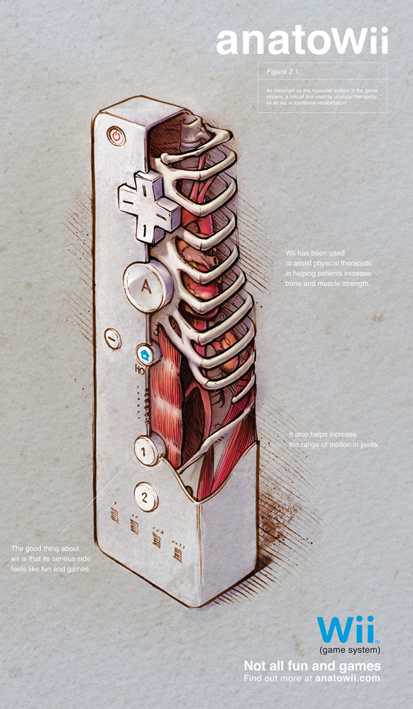
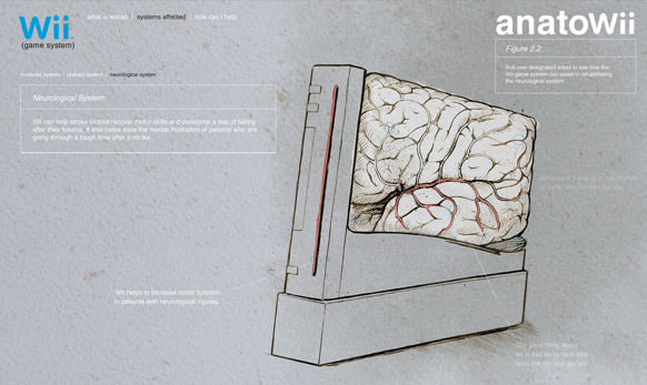
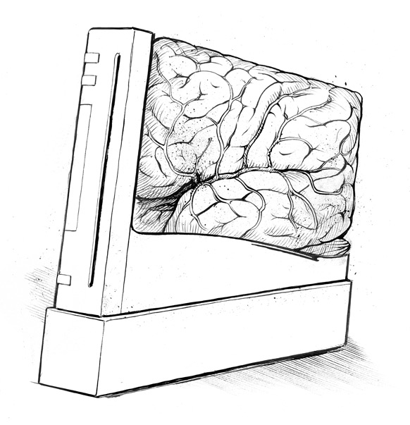
This work stemmed from a project where we were asked to introduce the Nintendo Wii to physical therapists and doctors as a tool to assist with traditional physical therapy (PT). I loved the idea of gaming extending beyond “gamers” and recreation. I felt that the console and components of the Wii were a great metaphor for parts of the human body and to demonstrate how the Wii parts might be an extension of the human. I guess one could argue there’s a little cyborg action going on there.
Visually, my original concept was for the entire campaign to be digital, so within each illustration mouse rollovers would highlight each biological system with color (among other features). These features would visually show the doctor each system, and call out specific ways the Wii assists traditional physical therapy for each particular system.
Vart finner du din inspiration?
I personally find inspiration in other cultures, experiences, eras, music, other design genres, and other designers. I find it difficult to really nail down anything specific. There’s so much to take in visually both online and on the street. In New York, I’m surrounded by aesthetics at every turn.
There was a recurring theme in this project that inspired the art: The use of long-established physical therapy techniques aided by a modern video game. The “high-tech” Wii being used to rehabilitate old, tired, or broken down body parts. Therefore, I felt a natural push for the artwork to blend old with new: old style illustration (Da Vinci inspired) with the sleek design of new tech.
Hur ser ditt spelintresse ut?
I play a lot of games on the Wii. Which made the project even more fun for me. I spent a lot of time “researching” the subject. Any game from the Super Mario Brothers collection will keep me entertained for hours. I just wish Mario Kart weren’t so addictive; I’d have more time to design things.
Något du vill tillägga?
For the illustration I worked with award-winning illustrator John Foerster. He’s a practicing medical illustrator and professor of Illustration at the Savannah College of Art and Design.
Inga kommentarer.
 Spelifierade ambigram
 Dagens bild – Luftens mästare
 Dagens bild – Det sista myntet
 Dagens bild – Dödspiloten
 Dagens bild – Förvandlingen
 Dagens bild – Tiden innan äventyren